For more email conversions, build better landing pages
By Oscar Sandstrom | oscar.sandstrom@viseo.se
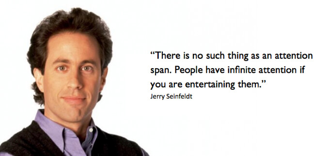
I often hear people saying “People have no attention span anymore”. Well I don’t think that’s entirely accurate. And nobody explains why this is a fallacy better than Jerry Seinfeld himself.
And this principle holds true for those you try to engage with through your mailing campaigns. If you can entertain, you will continue to engage; moving people along their own customer journeys and further along your sales funnel.
But how do we keep people entertained?
Well, since I’ve been helping different companies across different industries achieve better conversions, I’ve learned that there are a few core aspects that need to be considered in both your mailing campaigns and landing pages. They are:
- Friction
- Attention ratio
- Message match
- Readability
Now I know that this might sound like pure jargon but it’s important to know that each of these aspects can be easily managed by almost anyone. You just have to understand the basic idea and implement best practices into your own mailings and landing pages. Let’s walk through it.
Friction
Friction in this context refers to all the things that might stop your visitor from converting. It can be anything from a slow loading page, to a subscribe button placed at the bottom of a page instead of the top or directing visitors to a page that doesn’t match the mailing they were sent from.
If a visitor is obstructed in their experience whilst on their way to or visiting your landing page, then you have friction and it’s this friction that will lose you customers.
Now whilst some kinds of friction, a slow loading web page for example, might be out of your control the most important two aspects, message match and readability are well within your control.
Attention ratio
Attention Ratio is the number things you can do on the landing page versus the number of things you want the customer to be doing. Determining the attention ration is the first thing we look at when we help companies with their conversion rate optimization because it’s arguably the most important. Ideally, your attention ratio should be 1:1 where what you want your reader or customer to do is the only thing they can do on the page you direct them to.
Unfortunately, most landing pages and mailings are filled with a number of things that a company wants the reader to do. Things like sharing the latest company updates, reading relevant blog posts, buying a product or service, joining an upcoming event and sharing across social channels are all pretty commonly seen in just ONE mailing or on one landing page. But this is too much.
You should instead focus on one single-purpose call-to-actions and messages both in your mailings and your landing pages. Using this process to design your mailings will encourage people to focus their attention on the action you really want them to do. So when you’re creating your next mailing, take a moment to really consider what the desired action is for this mailing and whether the landing page correctly caters for the desired action . Is it increased sales on one specific product? Is it more event signups? Is it more click throughs on a blog post? Whatever the action, make sure the mailing and landing page clearly focuses on getting that action completed.
Message match
Message match is a term that describes whether the message on the page people are coming from matches the message on the page people are driven to. For example, whether your breakfast seminar invite sends people to the event signup page (a good message match) or if it sends them to your homepage (a bad message match).
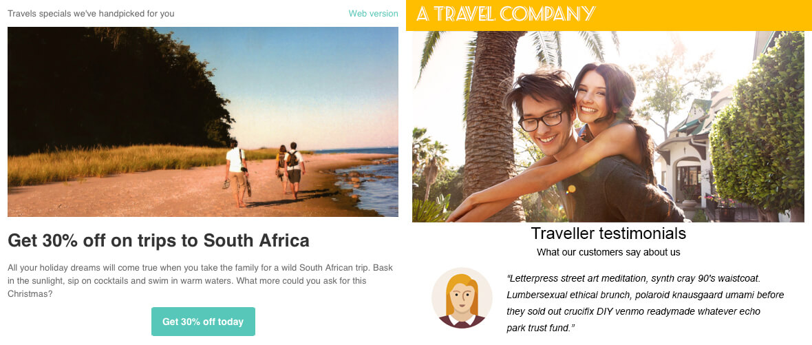
Take a look at these two examples to see the difference between a good message match and a bad message match.
Bad
Call-to-action message from a mailing: “Get 30% off on trips to South Africa”
Landing page message: “What our customers have to say about us”
Good
Call-to-action message from a mailing: “Get 30% off on trips to South Africa”
Landing page message “Get 30% off on trips to South Africa – Book now”
You can see that creating a message match across your mailing and landing page isn’t that difficult to achieve if you stick to the same principles used in the ‘good’ example above:
- Use the same headline copy
- Use the same images or graphics
- Promote the same product (and not just the same category)
- Use the same call to action
- Use the same color and design
Related post: Design Tips for Email Newsletters (Part One)
Readability
Even the best copywriter in the world won’t save your email conversions if your readability is poor. Why would you spend all those hours crafting awesome copy in an email or landing page if nobody gets a chance to read it? In your next mailing (and its landing pages), boost your conversions by using;
An easy to read typeface
People can read larger text much more easily than trying to squint at a teeny tiny text. So go for 14px or 16px on your landing pages and mailings. As well, choose a typeface that’s easy to read in style. After reading tons of tests about the impact of typeface/font on conversions, the conclusion is that if the text is easy to read it is good enough. Any common font like Arial and Calibri will do.
Correct line height
Although there are exceptions, the optimal line height is 24px. If you have a designer in-house, check in with them and ask what they are using currently. If you don’t have a designer and don’t know how to manage this yourself, then turn to some basic design pointers.
Less characters per line
Shorter lines are easier to read. Aim for 70-85 characters per line.
Sub-headings
A reader should be able to both grasp the content and be interested to continue reading just from reading the headline and sub-headings. Using sub-headings also plays a visual role by breaking up large blocks of text so that the entire page appears more digestible to the eyes of the reader.
Bullet points
Using bullet points is a great way to highlight key features or important points without over-explaining the point.
Short sentences
Mark Twain once wrote “I didn’t have time to write a short letter, so I wrote a long one instead”. It’s ok to take the time to boil down the copy to shorter sentences and overall length. Short is good. Say it to yourself. Repeat it.
New paragraph every 3 lines
Beware the dreaded wall to text. A new paragraph both makes and gives the feeling of a easy read.
Related tutorial: 11 Must-have Elements for Your Next Email Campaign
Follow these 4 core aspects in your next campaign
Attention ratio, friction, message match and readability are all elements that can be easily managed in your own mailings and landing pages. So what are you waiting for? Get started and start enjoying more conversions.
Thoughts or ideas on this post?
Start a thread with us on Twitter using the handles @ViseoSverige and @Ungapped.


