TUTORIAL: 11 must-have elements for your next email campaign
By Sophia Skinbjerg | sophia.skinbjerg@ungapped.com
Are you starting to use email marketing for your business? Or are you a well-seasoned emailer looking to make some improvements here and there? Either way, nice work on wanting to improve! It’s a great but important step when you’re growing your business. And regardless of your current email marketing efforts, you’re going to be able to use all of these must-have elements to take your email campaigns to the next level – enjoy!
How this will work
If you’ve read some of our other posts, you’ll notice this post will run a little differently. Since it’s a tutorial, we’ll work through a mailing, from top to bottom, that I’ve created using the Ungapped platform.
Oops! Think you’ve ended up in the wrong place? Head to our blog for some pre-reading, otherwise keep scrolling!
If you’re already a user you’ll be able to jump into the dashboard and rework your mailings right away but if you’re not a Ungapped user, you should still keep reading because you’ll find this helpful – promise!
If you’re not a Ungapped user, why not give us a try for free?
Last thing before we get started: these must-have elements haven’t been listed in any order of impotance rather just a logical listing as I work through a mailing in Ungapped. If you want the most out of your mailings then your best bet is to use them in coordination with one another. Let’s get started.
1. Segmented contact list
The very first must-have element to your next email campaign actually isn’t within the email body at all – it’s to whom you’re sending to.
In order for you to maximize the benefits of the mailing– both for subscribers and for your business, you need to be able to segment your contacts based on their personal identifiers and where they are at in your buyer’s journey. Not doing so and instead continuing to send the same email blast to all subscribers will unlikely yield great results – in fact, it may harm your readership. Instead you need to start thinking of who the mailing is intended to and why?
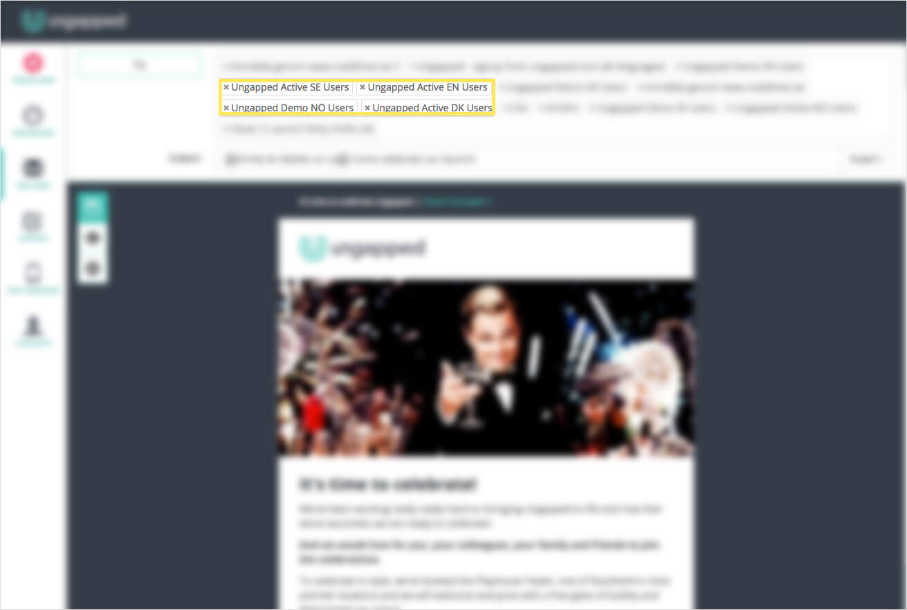
For example, not all of your subscribers need to know about the local event you’re hosting if half of your subscribers are international. Likewise, not everyone should get a blast written in Swedish if portions of your subscribers are English speakers. In the example below you can see the contact list has been segmented to include our active users from the past 6 months in each of their respective languages.
Segmenting your contacts is closely tied to your overall mailing and company goals which I discuss a little later in this post but recognizing the importance of a segmented contact list is the first must-have element in achieving better results from your email campaigns.
2. Subject line, sender email and name
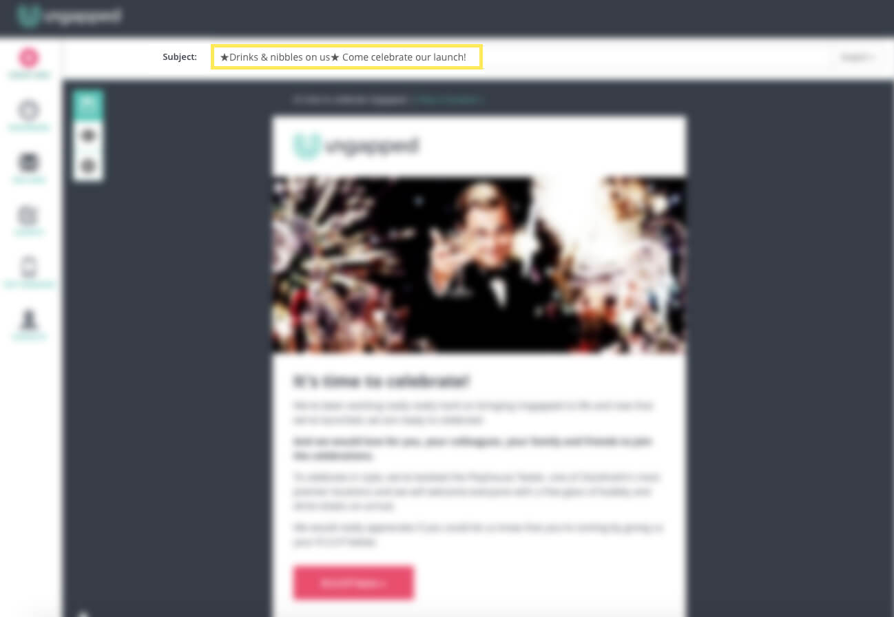
The next element we need to think about is just as above and not actually in your email body either– it’s the subject line and sender details that a subscriber will see in their inbox. Let’s look at the subject line first.
There’s so much literature about how you should formulate your subject line, both academic and well, not so academic. From much of the industry there’s a sensationalist approach or strong encouragement to create subject lines that are enticing and ‘make your reader want to click more’. While this might be worthwhile if you want to promote fiction novels or dish the latest celebrity dirt, if you’re a B2B company or professional services company, this might not be the best approach.
The reason we discourage using sensationalist subject lines? It’s really misleading and isn’t a genuine representation of what your mailing is about. It can also hurt your deliverability with gimmicky subjects lines ending up in the spam folder or worse, blocked from inboxes.
When you’re sending to your recipients, make sure that your sender email and name is a true representation of either yourself or your company. info@businessname.com, hello@businessname.com, support@businessname.com are all standard examples and are totally acceptable to use as a sender email. What’s not ok is using addresses like exxygrl@xxx.com or friend123@yahoo.com. Addresses like this will be quickly blocked by spam filters and won’t be delivered to inboxes at all.
So, apply the general rule of thumb and use real names and real business addresses.
3. View in your browser
Once a subscriber clicks a mailing in their inbox, the first thing they will or won’t see is images and visual material.
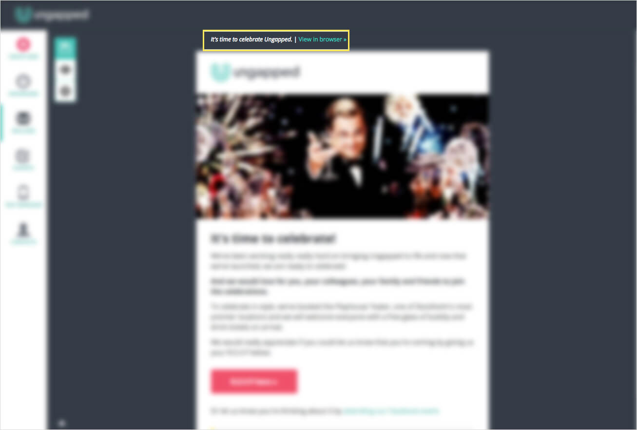
Since lot of email readers prevent automatic rendering of images there’s a good chance that some subscribers won’t be able to view the mailing correctly. Therefore it’s important that you have a ‘view in browser’ option that allows the subscriber to view the mailing on a hosted site.
A reader will notice very quickly whether or not they can’t see all the material, so placing this option at the top of the mailing will allow readers to quickly spot and navigate to the browser view.
4. Responsive design
I feel like I rant about using responsive design each and every blog post but that’s because it’s a big deal – you simply can’t afford to get it wrong.
I used to have some patience for mailings that weren’t responsive but now I simply send them to the trash right away because it shows me that the company or brand really isn’t trying to have a two-way dialogue with me. If they did they would know what device I (and other users) read from and design content accordingly.
For more about the importance of responsive design head over here.
5. Personalized fields
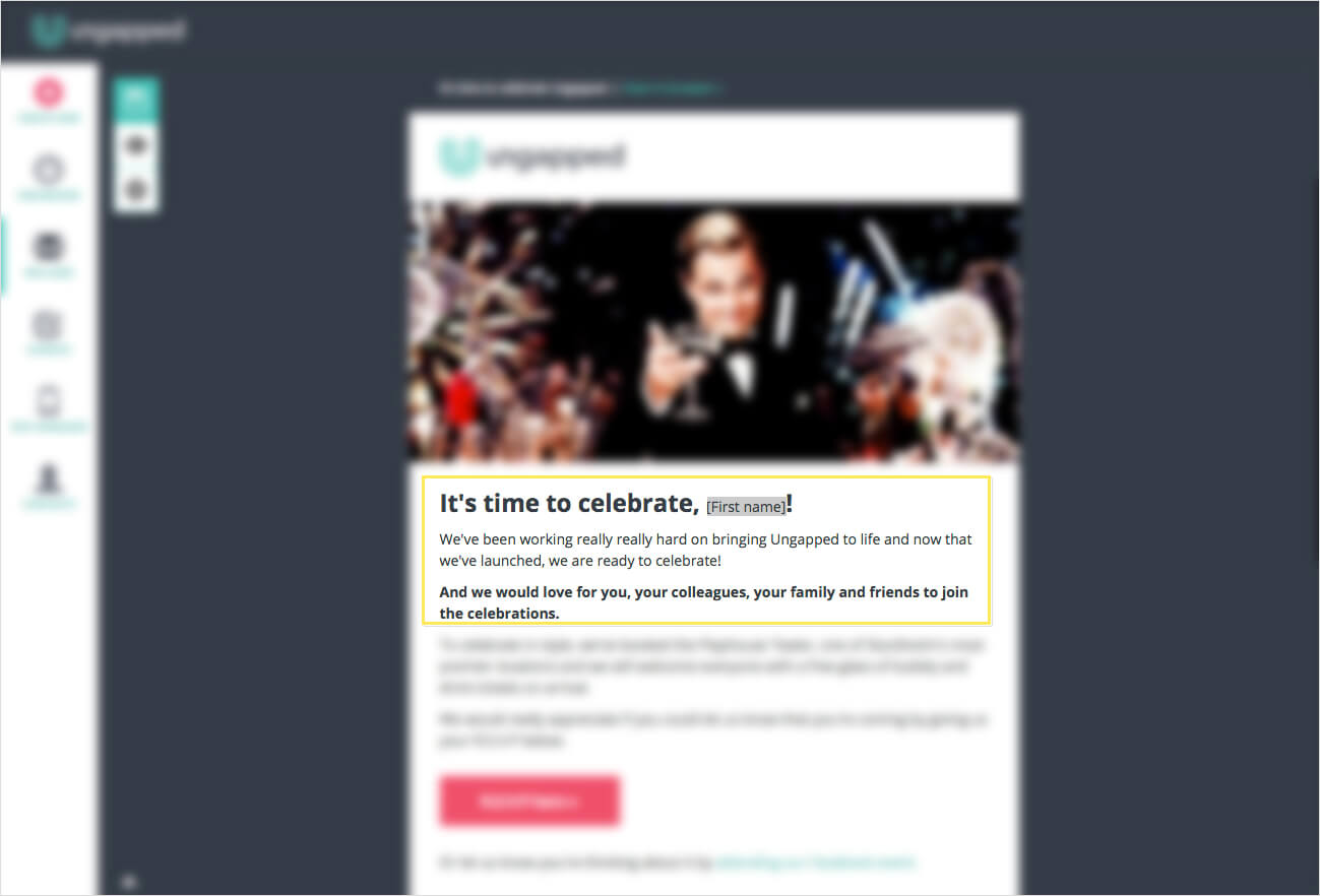
When we start a conversation with someone, the social norm is to first address the person, raise the topic you’re going to discuss and then continue the conversation. The same principles can be applied to our email marketing.
Now this doesn’t mean writing the content of your mailing to replicate an actual face-to-face conversation but including some personalization like first names, last names and company name is a great start. Again, you don’t need to use personalized fields in all sections of your mailing but in the beginning and in the sign-off are generally good places to start.
Psst! You’re half-way there! Good job!
6. Clear call-to-action
A must-have element that many businesses overlook in their email campaigns is a clear call to action.
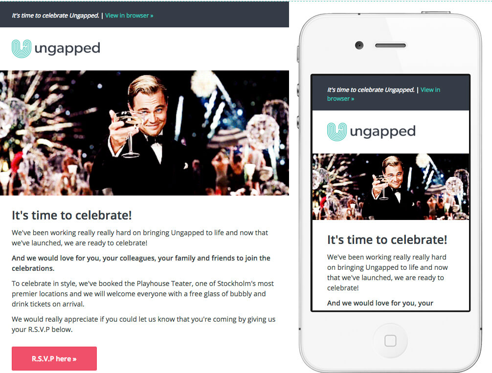
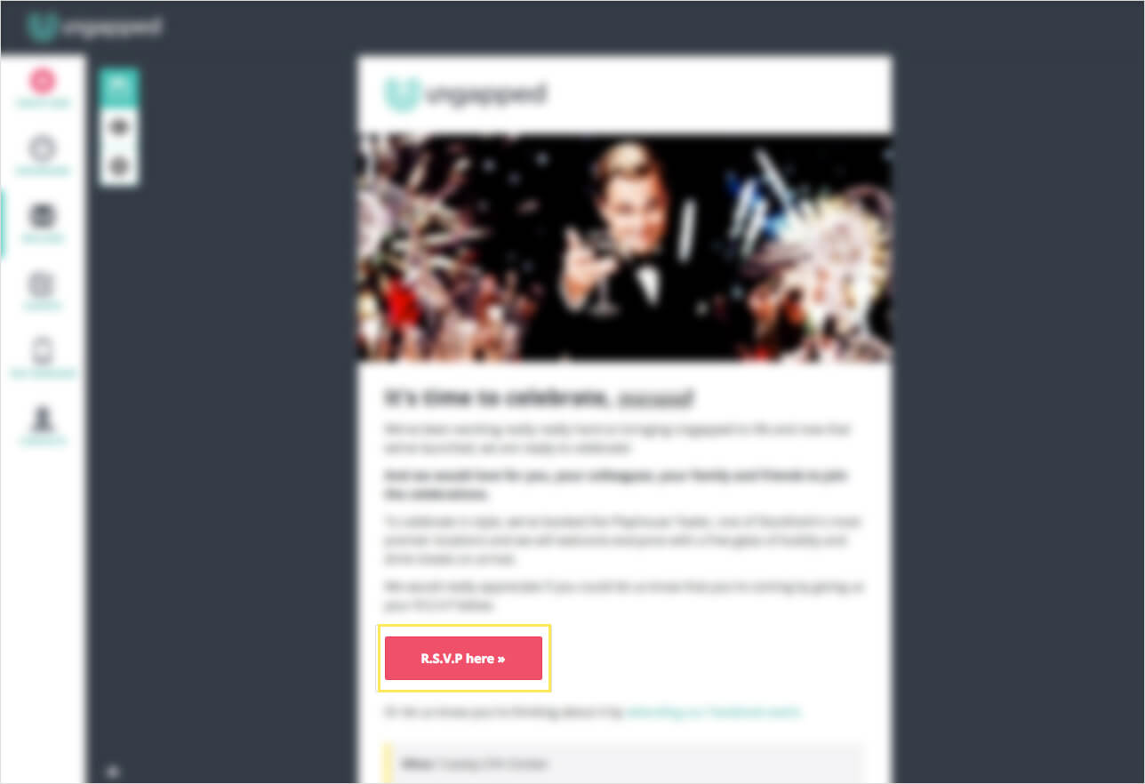
Every mailing must have a purpose that is attached to an overall company or brand goal. Whether you’re trying to increase webshop purchases before the end of summer, get 50 registered attendees to your public seminar or encourage half of your current subscribers to sign up to a new type of newsletter, your mailings must include a call-to-action that encourages people to do the behavior you want them to do. Take a look at the example below.
You can see that following the body text is a big pink button with “R.S.V.P here”. It demonstrates very clearly what I should do and although it’s direct, it’s not invasive but rather seems like a natural progression.
7. Share options
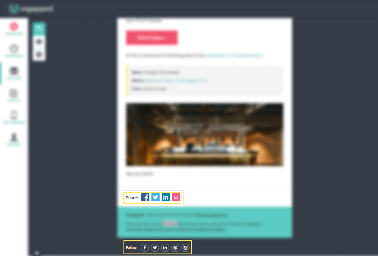
As we move towards the lower half of the mailing, here is where you will find the opportunity to weave in elements like share buttons and links.
It’s an easy thing to include and kind of a ‘two birds, one stone’ concept where you’re providing convenience for your reader and sales potential for your own company.
Though it shouldn’t be the focus of a mailing, having share buttons and links at least gives the option for the reader to share something across their social networks should they want to. If they do, you’ve scored some increased reach for your content and potentially obtained some new subscribers and customers. See! Two birds, one stone.
8. Company contact details
One of the last must-have elements to include in your email campaigns is your company or brand’s contact details that includes a street address (should this be applicable).
This follows the same principle of using real sender emails and names whereby it’s just best practice to be honest about who your company is and where you are located. It’s also convenient for the reader should they want to contact you directly after reading your mailing.
9. Unsubscribe options
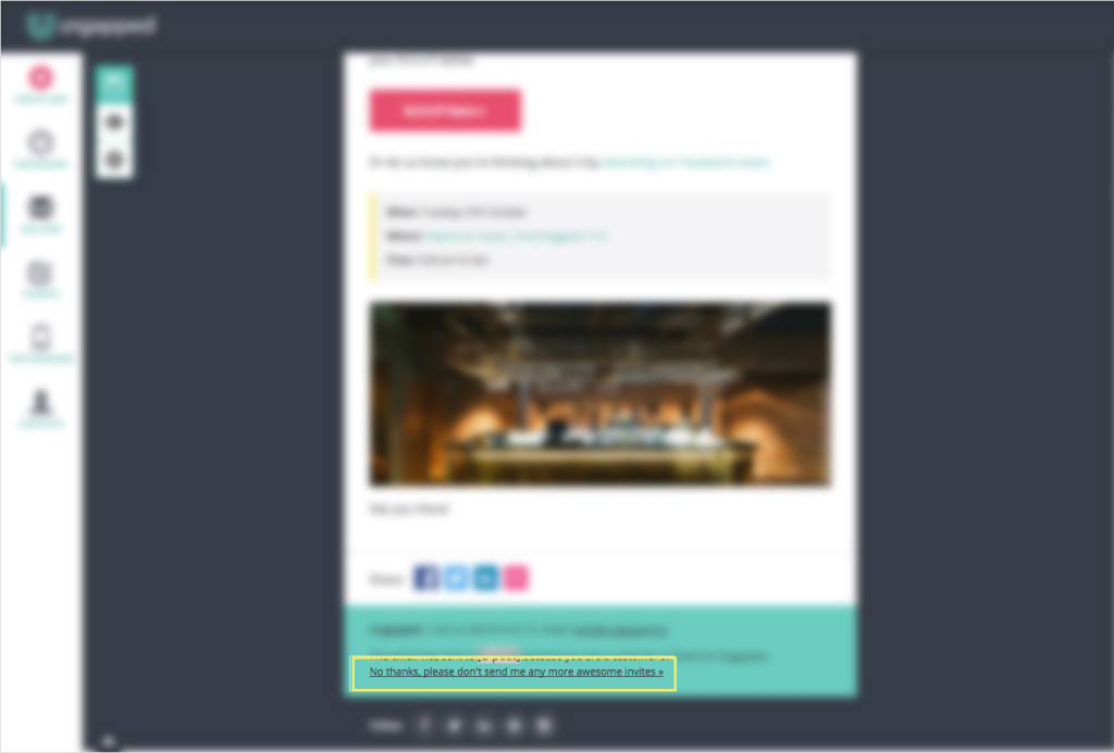
It is absolutely mandatory that you include unsubscribe options in all your non-transactional mailings. I cannot stress how important this is, so much so that I’ve covered this in many of our other blog posts but that is because it’s crucial from both a legal standpoint and a customer experience perspective.
Having people voluntarily unsubscribe can actually improve your business too. Since people that aren’t interested in your products or services (and are therefore low sales opportunity) are taken out of the list, you can now focus on those that are interested and hone your marketing in on their needs.
10. Test, test, test!
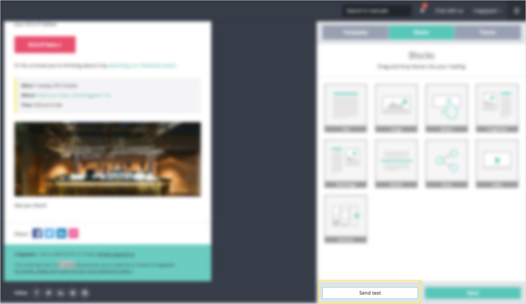
How many times do you test you mailing before sending to your contact lists? Once? Twice? None? I’m continuously testing my mailings as I go and to my coworkers as well – it never hurts to get an extra set of eyes to look over what I’ve done.
When testing your mailing, be sure to send the mailing to different email accounts (if you have them). I send to my work account via Apple Mail, which I access on desktop, and my personal gmail account, which I access from my phone. That way I can be sure that the mailing looks great and functions across multiple devices and multiple readers.
Don’t get responsive designs with your current email provider? Create an account with us for free.
11. Clear reporting
The final must-have element to any email campaign is the ability to clearly see the results and report how the mailing has either achieved goals or contributed to achieving larger goals.
Not having a clear reporting process or system in place is a mistake that a lot of small businesses and even larger marketing departments make and it can often be attributed to their current email marketing software or app not including rich insights or statistics. And it’s really unfortunate because you’re never going to know the effect of your email marketing.
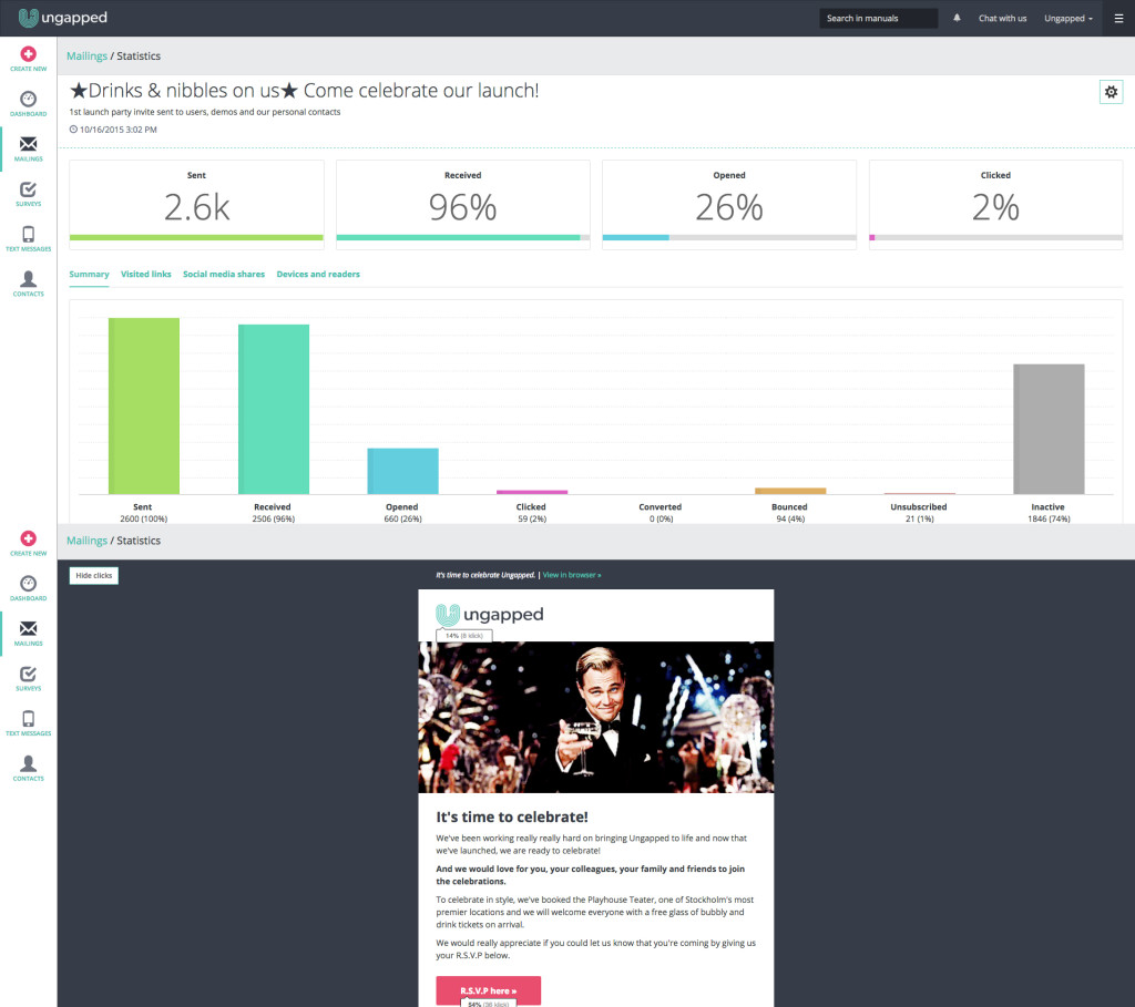
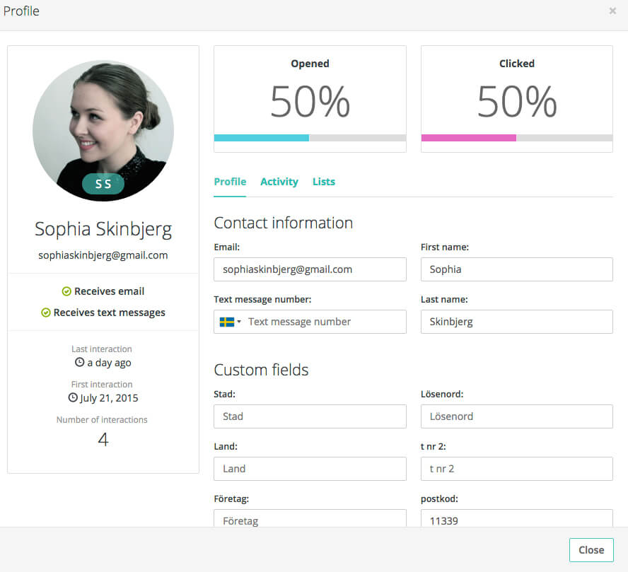
On the Ungapped platform, I can see some high-level stats like total recipients, open-rate, clicks, unsubscribes etc. But I also get in-depth insights such as links people have clicked, bounce rates, inactive users as well as individual contact cards for all contacts which show everything from basic details right through to previous interactions with my mailings. It makes both reporting a breeze and it allows me to better plan future campaigns based on actual behavior from our users.
Missing rich insights? Sign up for a free account and see what you’re missing.
You’ve finished the tutorial! Kudos!
Here’s hoping you found the walk-through of must-haves for your next email campaign useful.
If you’d like to share your thoughts or even challenge us to a question then shout out to us across the socials. You can find us on Facebook, Twitter and Pinterest or tweet directly to me at @sophiaskinbjerg.
