
15 email design inspirations for the rest of your summer
By Sophia Skinbjerg | sophia.skinbjerg@ungapped.com
Take advantage of the color, excitement and fun that summer offers and add it to your email designs. It’s sure to be a hit for your subscribers regardless of whether they are laying on the beach or stuck in the office.
Summer is splashed with color
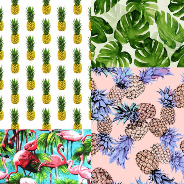
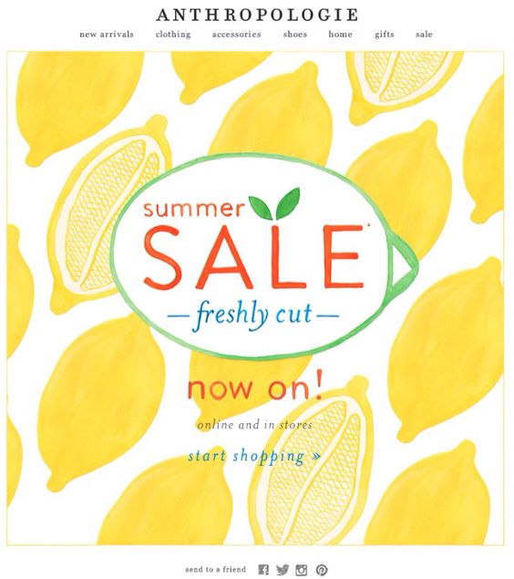
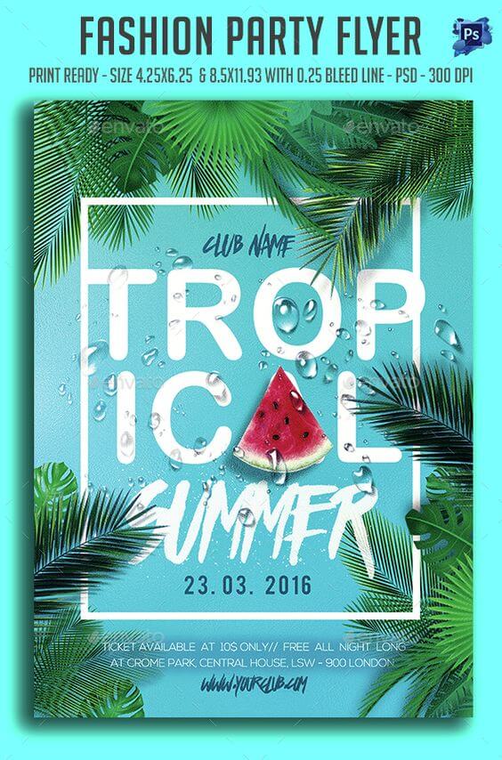
One of the reasons that summer is amazing is that there is suddenly a burst in color in everything around us; food, fashion, and yes even emails. Nothing says summer like tropical yellow or beach blue. Use this sunny period to freshen up your emails with some seasonal colors, patterns or prints. Here are some of my favorites from Pinterest:

Gifs aren’t just fun – they encourage engagement
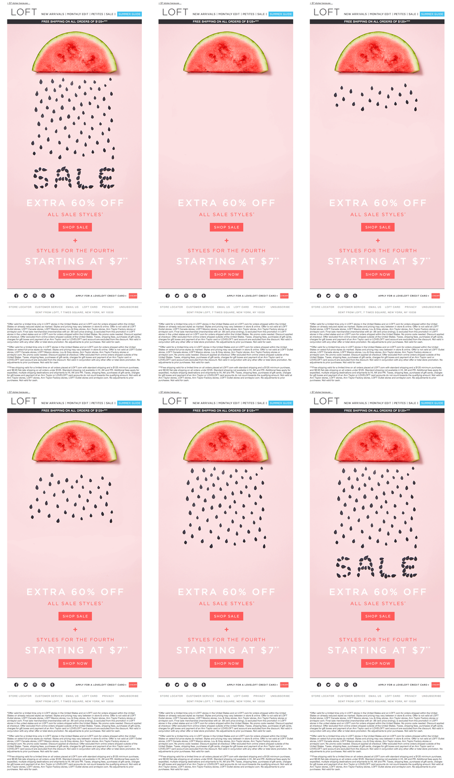
I don’t know about you but when I see a gif I can’t help but keep looking until I’ve seen the entire loop. Which kind of makes sites like giphy my kryptonite. But the same applies to emails with gifs; I can’t help looking/reading. There’s some great ones on pinterest that combine both the gif with some summer #flava.

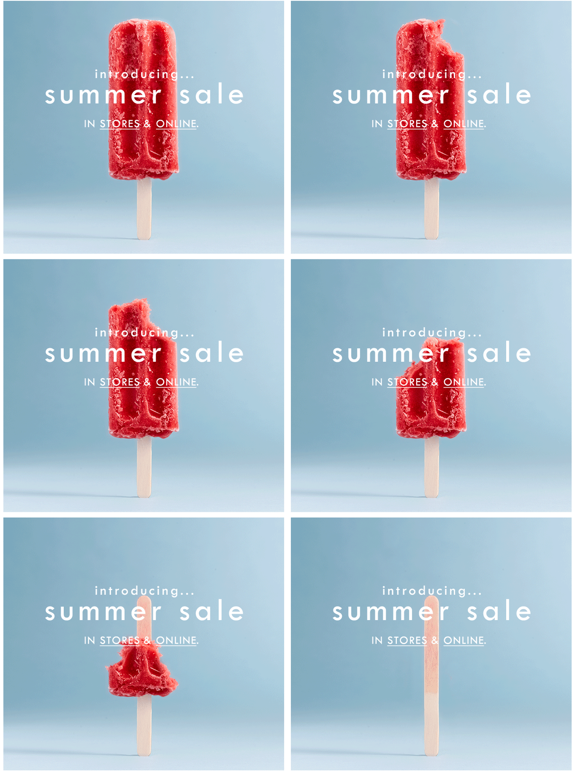
Don’t like the gif? Make it a still.
Because there’s no reason to be boring in the summer.
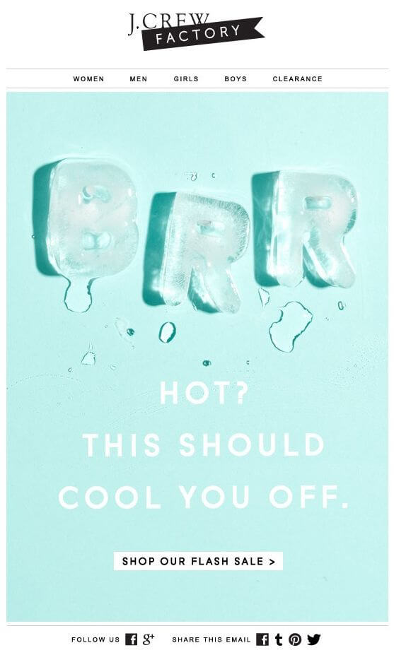
Tickle your email design inspiration with smaller screens
We know that people aren’t in the office during the summer so why would you limit your designs to devices you know people aren’t on? There’s some absolute great examples on our Pinterest board Splashed for summer. My favorite comes from J.Crew (who in my opinion, always rock the inbox).

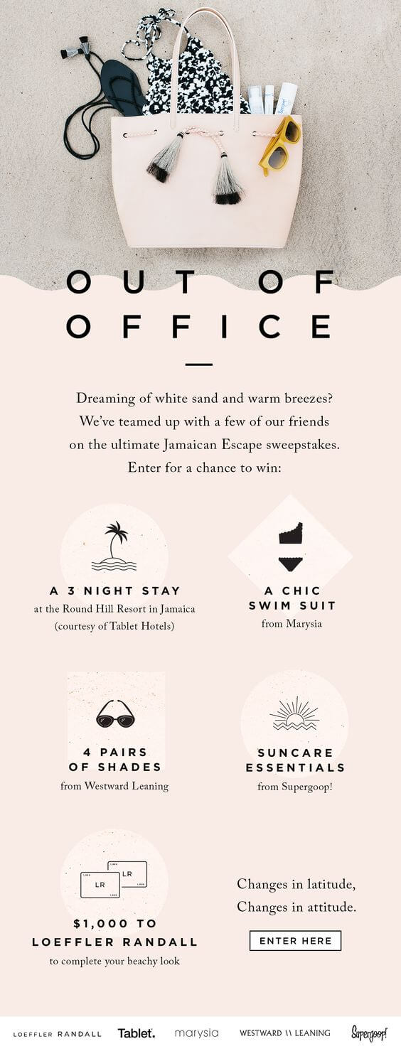
Nothing boosts engagement like a giveaway
Because we all know that people will still get the itch to check their inbox even while laying on their beach towel or sipping that mojito.
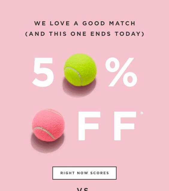
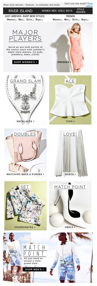
Summer time = sport time
Which also happens to be a great source of design inspiration. This summer is chock full of global sports events that can be used to add some novelty to your mailings. Just remember to keep it relevant to your own subscribers.
Less is more with design
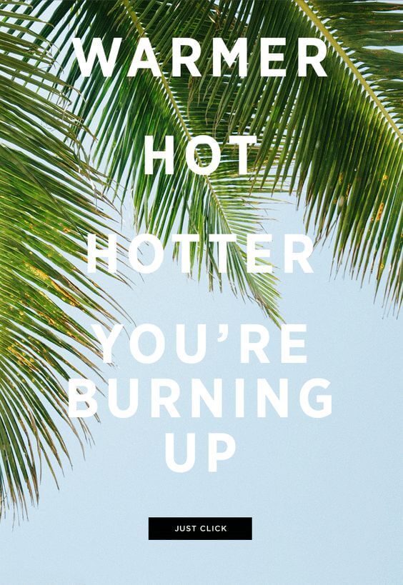
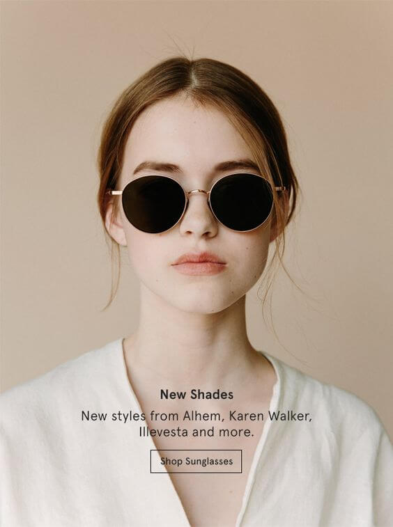
I’ve talked about this a couple of times in previous posts but it’s worth mentioning once again. Summer is when people are on vacation; they are relaxing and taking time off, away from devices. So make sure your mailings aren’t overwhelming people with a million different CTAs. One or two is enough. Read more about designing your content for summer over here.
Related: How to create call-to-actions that are irresistible
Here are two examples that make me happy to look at them but simultaneously I also want to click through to start buying.
Making your products synonymous with summer is smart (when done well)
I applaud brands that can seamlessly integrate their products or service with a shared experience, like summer. In the example below there’s a bunch of summer activities that we can all imagine doing on a hot summer day. Cleverly, Warby Parker have also paired each activity to one of their sunglasses. Smart right?

Want more?
For more inspiration that’s fresh and splashed in color, go check out our Pinterest board. You won’t regret it.
While I would love to take credit for all these amazing designs, they were sourced from Pinterest. Find the original owners here.