
Easy ways to improve your survey design
By Oscar Jonsson | oscar.jonsson@ungapped.com
How you design your content influences how people engage with it. And surveys are no different. Everything from the structure to the copy to where you place your call-to-action is going to have an impact on how someone reads and completes, or does not complete, your survey. But if you’re not a designer, this might be something new to you. Don’t worry, it’s nothing to stress about. There are a number of things you can do (easily) to improve your survey design – no expert needed.
1. Think of a feeling you want people to feel – and reflect it in your design
The very purpose of your survey should form the base of your survey design. Everything from language to imagery to length are dictated by what information you’re trying to obtain via the survey. For example, is the survey for a specific business purpose like further training? If yes then you’ll likely need informative language, branded imagery and questions that seek both basic contact info but also previous training or education.
Perhaps you’re using your survey to create a guest list for a fun after work event. Great! Since you want people to be excited about coming to your event then you should reflect this in the design with color and enticing imagery.
Maybe you want to create a survey for internal staff that kickstarts some creative brainstorming. Instead of making a plain black and white survey that will get more yawns than “yays!”, design your survey in a way that will prompt creative thinking with imagery, fun language and probing question types.
Whatever the purpose of your survey, start thinking about how people should feel when filling out the survey and use this to build your survey elements.
“Design for people, not awards”
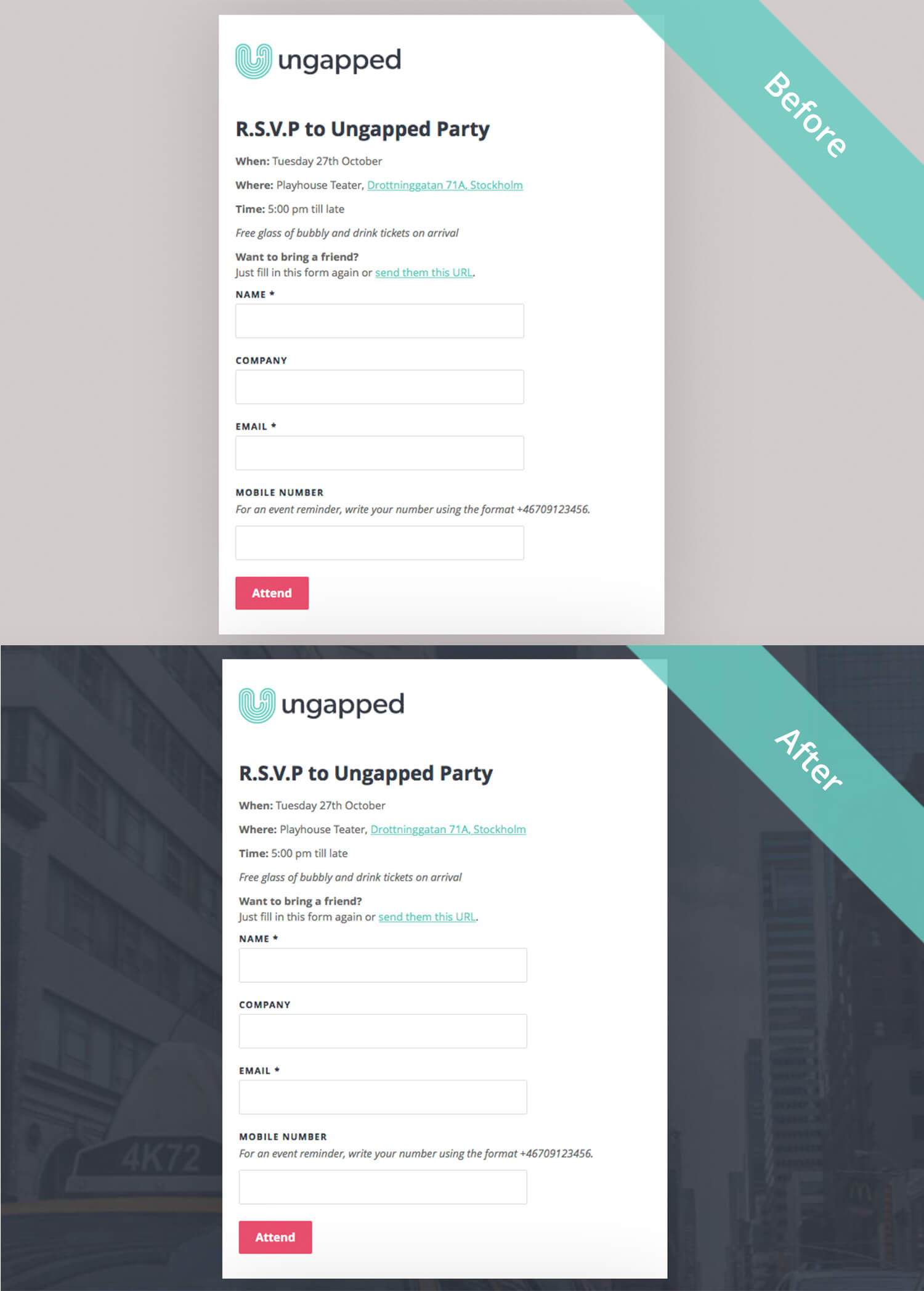
2. Use background images for a fast way to stand out
One of the simplest yet most effective ways to better the design of your survey is by simply adding a background image. Not only will it look great but adding a background image plays an important role in first catching the eye of a reader and encouraging them to read and fill out the survey.
It doesn’t even need to be an image or graphic that’s been custom-designed for the survey. A simple image or color that is related to the survey content works too. There are a bunch of online resources that can point you in the right direction for free-to-use stock images. One is this comprehensive guide from Canva where you can find the 73 Best Sites To Find Awesome Free Images.
Take a look at some examples below that show the difference a background image can make.
3. Use your company’s design guidelines for consistency and convenience
If you’ve hit a brick wall and can’t think of anything new or unique for your survey design, then use your company’s design guidelines as a base for inspiration. Although this might sound a little ‘safe’, using your company’s guidelines is an easy way to create something that looks well put together, even without any design training. With your company’s typeface, color scheme and images, half the work is already done!
Using the same design guidelines in your survey design as your company also plays an important practical role in the user’s or readers experience. If your survey design is consistent with your company’s branding, readers are better able to know who the survey is from. If they know who it’s from and can identify their relationship to your brand, they’ll be more likely to actually complete the survey.
Related: Design tips for email newsletters part one
4. Don’t be lazy – play around with colors, fonts and margin
With most survey tools you’ll usually get a default design or template to work with. But don’t let this get you into a bad habit. If your platform allows you to change fonts, buttons, margins and backgrounds then do it! Even if you’re short on creative ideas and choose to use company design guidelines, you can still make subtle changes that will enhance the survey design. Take a look at the example below. We’ve used the survey tool to create a signup form for a breakfast seminar. It’s the same content just with different colors, fonts and background.
Our survey tool is easy-to-use and we won’t charge you for extra themes. Give it a try today.
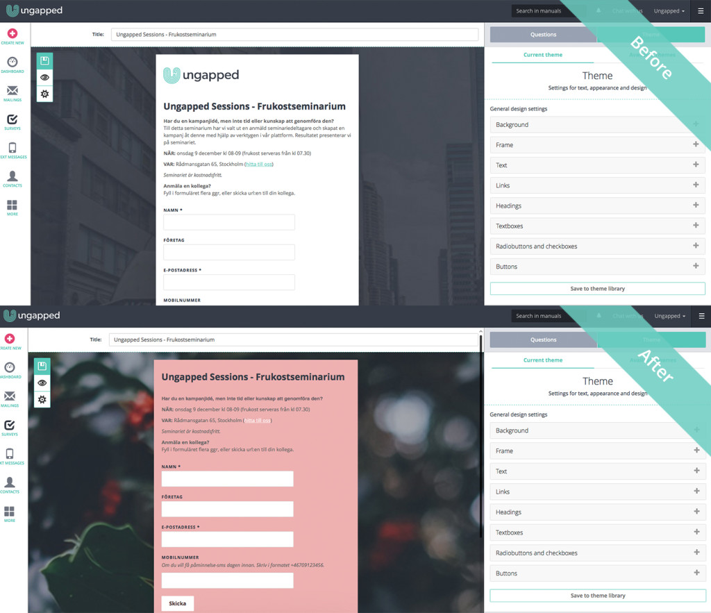
Use the theme editor to play around with different colors, fonts and margins
5. Use a clear call-to-action
A simple win that you can score with your survey design is making sure that you have a call-to-action that is clear in both language and design.
For example, if you want people to submit their feedback, label the button ‘submit feedback’. If you want people to R.S.V.P to an event, label the button ‘attend’. If you’re giving away a free download, label the button ‘download now’. If there is any confusion about what will happen after someone clicks a call-to-action, you’re risking confusion and ultimately people navigating away from your survey page.
To make your CTA clear, use a color that stands out from the background and surrounding text. Don’t be shy to make the CTA slightly bigger than you would regular text – the button is where you want them to press.
6. Make sure your survey design makes it easy to answer on a handheld device
There is nothing worse than trying to complete a survey only to find that you can’t properly view or answer because the survey design hasn’t been made responsive for your device.
If you’re using a quality platform, you’re designs should be made automatically responsive. If not, you need to check how they can be made responsive or consider swapping providers. Without a responsive survey design you risk losing completed surveys or signup forms.
Related: Best survey marketing tools what features to look for