
Design Tips for Email Newsletters – Part One
By Sophia Skinbjerg | sophia.skinbjerg@ungapped.com
It is always useful to consider ways that the design of your mailing can be more effective. So whether you’re just starting to send mailings to your customers or if you have been doing it for years, take a read through these design tips for email newsletters and see where you could make some changes.
1. Header
The first thing a subscriber sees when they click to view your mailing is the header. Therefore, it is important that your header conveys an accurate preview of what the mailing is about so that your reader is interested enough to scroll and keep reading.
Depending on your mailing content (as well as your brand), header contents can vary. Some brands choose to keep headers very simplistic with just the use of a logo before displaying content. Others like to have a more elaborate header that contains not only a logo but also recent social media activity, as designmilk does. You can see this in the examples below.
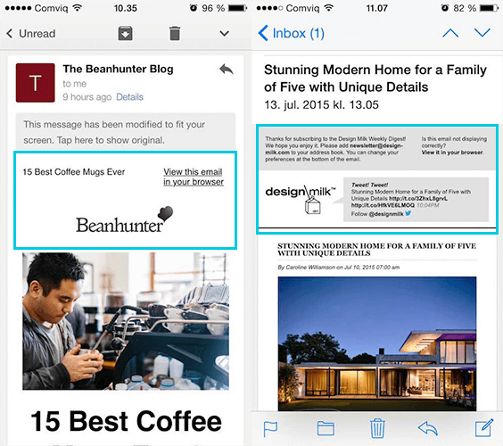
Examples of different headers. Images: personal source
If you have been using the same header for years perhaps it is time to reconsider what you include at the top of your mailing. Create a new template and run the new design for a short period (4-12 weeks) and see what the engagement numbers are like – you might be surprised.
2. Section headings and titles
Including headings and titles in your mailing is an important way to separate information so that readers can easily navigate and comprehend what they are actually reading.
The two examples below make really good use of headings and body text that is easy to read and follows a nice flow. When a mailing is designed like this, the reader is much more inclined to continue reading compared to when a mailing isn’t separated by headings or titles – they will very likely jump out of these mailings right away.
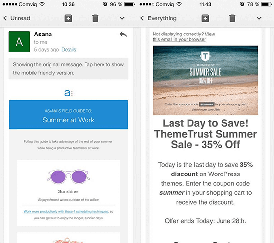
Use headers and titles to break up extensive text. Images: personal source
When designing your next mailing take a look at the amount of text you have and see if it’s separated with headings and titles into easily read sections. If you see that their could be an improvement rethink where headings and titles can be best used as well as asking whether you minimize the amount of copy in the mailing.
3. Keep copy minimal
Copy that is designed and constructed to guide a reader through a conversion path is the most effective method for obtaining new customers (and increasing the number of loyal ones) through your mailings.
But this type of copy doesn’t have to be in any way long or extensive. It just has to understand and combine the needs of the reader and the intention of the mailing.
For example, if the goal of the mailing is to bring people back to a shopping cart then the design should reflect that by using simple, active-voice copy. If the goal of the mailing is to drive traffic to the blog the mailing shouldn’t contain the entire blog post; the mailing should contain short blog post previews, accompanied with simple call-to-actions to encourage people to click through either to individual posts or to the blog page. Runkeeper and Airbnb do very well in keeping their copy minimal yet it still manages to encourage me to click-through.
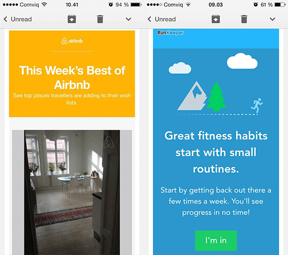
Airbnb and Runkeeper are great at using minimal copy in their mailings. Images: personal source
4. Focus on one or two call-to-actions
If you look at each of your individual mailings right now, could they each be summarized with one call-to-action?
If you’re answer is yes then well done! You’re on track to having well-designed mailings.
If you answered no it might be time to consider simplifying your content by including just one or two call-to-actions per mailing. This is important because the more call-to-actions you include per mailing, the more likely it is that your reader will a) not read the whole mailing and therefore b) never see more than one or two of your call-to-actions. And this kind of makes your job even harder.
So to determine whether you are including too many call-to-actions, ask yourself what the intention of each mailing is. Is it to drive traffic to the blog? Is it to encourage an upsell of a product or service? Or is it to bring people back to an abandoned cart? If you’re answering more than two or three intentions you might need to consider splitting each of these goals into separate mailing campaigns to simplify the content and enhance the reader’s experience.
Are you working in a small company? Read our guide on email strategy for small business >>
5. Introduce and complement content with images and GIFs
We’ve heard it a million times before, that “a picture tells a thousand words”. But why don’t we use visual material to our advantage more often?
Probably because we think that words are more direct and will guide the reader through the intended path better than visuals. This might be true but without the use of great visuals, it will be very difficult to grab your reader’s attention and they won’t look at your mailing long enough to even read what you have to say.
To make your mailing content more appealing to the eye, use images and GIFs to complement sections and stories. Don’t be afraid to use humor but be sure to keep them relevant and related in a way that’s not boring (e.g clichéd stock photos) or too abstract for the reader to understand.
Source: giphy.com
If you’re lucky enough to have a designer on your team, it might prove beneficial to have them create some simple graphics that are aligned with the visual identity of your brand. This way you’ll be sure to create unique material that no other brand will have used before.
Don’t have access to a designer? Get in touch with us and see if we can help with our professional services.
Read Design Tips for Newsletters – Part Two