12 things to check before you send a newsletter
By Sophia Skinbjerg | sophia.skinbjerg@ungapped.com
Before you send a newsletter, take the time to check these 12 things so that you don’t waste time repairing shortcuts later on. It’s worth the 2 min read.
Check that you’ve used a subject line and pre-header
I know it sounds like a bit of a rookie mistake but nonetheless it’s important to double check that you’ve got the correct subject line and pre-header in place. Some email marketing platforms allow you to duplicate mailings, subject line and pre-header included which only becomes an issue when the subject and pre-header have expired or are no longer relevant to your contact list.
For example, I always use previously sent newsletters as templates when I’m drafting the current month’s newsletter. But given the content changes each month, I need to be especially careful that I make the subject line and pre-header relevant to the current month’s content.
Choose your sender name and address
A small detail that can make the world of difference since it’s the very first thing people will see when your mailing lands in their inbox.
Both company sender names (e.g. Ungapped) and personal sender names (e.g. Jane Doe) have their pros and cons. Deciding which one to use really depends on the goal or function of the individual mailing as well as your overall email strategy. Some companies choose to use only personal sender names while others solely use company names.
We use a bit of both depending on the content. For example, our newsletters are always sent with the company name but press releases are often sent from “Sophia, from Ungapped”.
Whatever you choose, aim to keep it consistent across your subscription categories.
Select if you want to track with Google analytics or not
Not all email marketing platforms will allow you to track your mailings with Google analytics so it’s useful to do a quick check and see if it’s possible within your current provider.
If you’re an Ungapped user you can select Google analytics tracking in the settings tab in the mailing editor.
Checking this option is entirely up to you and really depends on the function of the mailing. In my opinion, transactional mailings can often go unchecked. Things like receipts, event confirmations and the like don’t need to be tracked with Google analytics.
In comparison, any mailing that contains a call-to-action that leads to your web page should be tracked with Google analytics so that come reporting time, you’ll be able to pinpoint how those mailings contributed to your overall conversion goals.
Related: How to measure the success of an email
Check you’re sending to the correct list
If you’ve worked super hard to put this fantastic mailing together, tested your mailing and finally clicked send only to realize that it went to the wrong list you’ll very quickly feel your stomach drop with dread.
So double check, triple check even quadruple check that you’ve attached the correct contact list before sending.
Related: 10 ethical ways to build a mailing list
Check buttons and links point to the right page
When we are looking to save time, it can be often be easier to duplicate old mailings and make small changes instead of starting from scratch every single time. However, when we do this it’s important to check that all buttons and links point to the correct page. There’s nothing worse than realizing that after sending a mailing out to your contacts that you’ve directed them to the wrong page.
Check images have alt-text
One of the biggest unknowns with email marketing is knowing how your mailings are going to look in people’s inboxes. With hundreds of email clients out there (Gmail, Apple Mail, Hotmail, Yahoo and Outlook just to name a few), it’s impossible to optimize and design for all at once. But there are things you can do to at least increase the chance of engagement; one of which is to use alt-text on all images in your mailing.
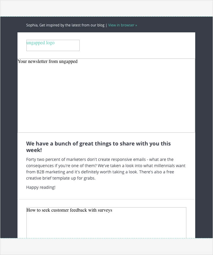
If your contact uses an email reader that allows for image display, you’ve got nothing to worry about. They’ll be shown the images as you intended. However, if your contact is using an email reader that doesn’t display images by default, including alt-text will allow them to see what should have been there.

Make sure you add alt-texts to all images. Source: Ungapped
Check that your mailing looks good on all devices
Last week I was shocked to learn that 42% of marketers aren’t creating responsive emails. So long as you’re using a good email marketing provider, you shouldn’t really be faced with this issue at all.
If you’re already using an email marketing platform that creates responsive emails – great! Give yourself a pat on the back.
If you’re not, it’s really important that you start thinking about making the switch. If you’re emails aren’t easily read on a mobile device, you’ll likely lose subscribers (and potential customers) after you send a newsletter.
Give contacts the chance to opt-out
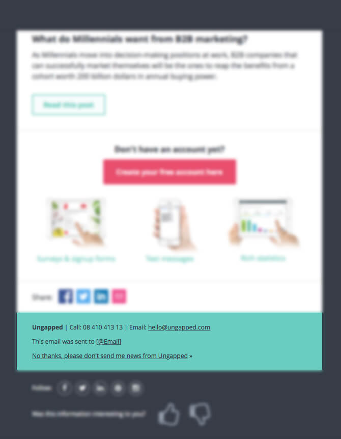
It’s mandatory that you include an unsubscribe link in all your mailings. It’s entirely up to you where you place it in each specific mailing but it’s generally best practice to place it somewhere that’s easily found, for example, the header or footer.

Place your unsubscribe nice and clear in the footer or header. Source: Ungapped
Disclose where you sourced email addresses from
A follow up from the point above. It’s important that you disclose where your contact’s email address was sourced from. You don’t need to give a long winded explanation – just something that clearly and concisely explains where you obtained it from.
If you’re emailing customers, it can be as simple as “This email was sent to @EMAIL because you a customer with us”.
If your emailing to subscribers that have opted in to receive your mailings then something like “This email was sent to @EMAIL because you have subscribed to our mailings” also works.
If you’re sending to an unsolicited list i.e. people you have no prior relationship with, it’s of paramount important that you make it easy for them to unsubscribe should they want to. For example “This email was sent to @EMAIL because we think you might need our service. You can opt out here”.
Be sure to follow this best practice because not doing so may harm your overall deliverability as more people report your mailings as spam.
Fix deliverability issues
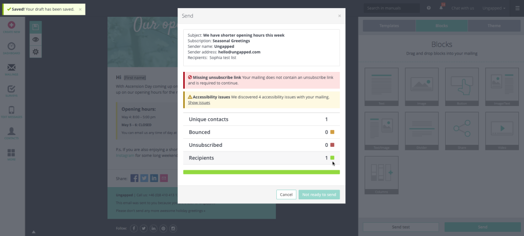
Depending on what provider you’re using, you might get warnings about deliverability issues before you send a newsletter. Knowing and fixing these issues are a huge help in boosting your mailings’ deliverability.

The example above shows that this particular mailing is missing an unsubscribe link and won’t be permitted to send unless one is inserted.
Fix accessibility issues
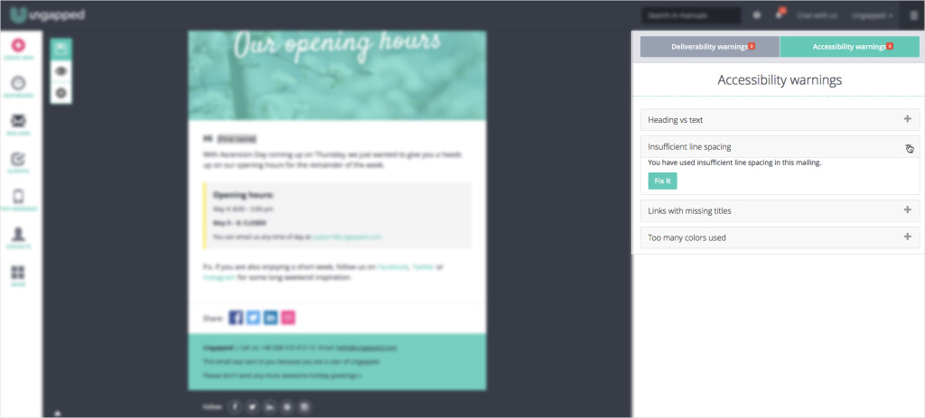
Accessibility issues are those that might prevent someone with vision or reading impairments from easily reading and comprehending the content in your mailings. It’s closely tied to the point above and also kind of depends on what email provider you’re using.

In the screenshot above, you can see that Ungapped shows you accessibility warnings before you send mailings and gives you one-click fixes for most issues.
Send a test mailing
The best way to check that your mailing or newsletter is working as it should be is to test send it to yourself and colleagues (if applicable). It’s a no brainer and should be done before every single mailing or newsletter you send out.
Double check your send date and time
It never hurts to double check even the most basic elements of a newsletter or mailing campaign, send date and time included. If you’re an Ungapped user you’ll have two options for sending; send immediately or schedule for sending later. If you schedule a mailing only to realize it’s the wrong day or time, you can always cancel the send out- phew!