
Best survey marketing tools: what features to look for?
By Sophia Skinbjerg | sophia.skinbjerg@ungapped.com
With the start of a new year, a lot of marketers are taking the chance to review the performance of their current platforms or services and a marketing tool commonly under review is the survey or signup form tool.
Now if you’re not happy with your current provider (or perhaps you’re looking to add to your toolbox) then take a quick look through this short feature list and make sure they are included in your new chosen platform.
1. Drag and drop editor
If you’re not familiar with html or front-end development then the most important feature in the best survey marketing tools is a drag and drop editor. A drag and drop editor will allow you to easily make changes to your surveys and signup forms easily – which is a weight off your shoulders should you happen to be the only one responsible for publishing and sending out surveys.
Without a drag and drop editing tool, or at least something that allows you to easily edit survey content, you’ll likely find yourself going between marketing and design staff which we all know takes time. Which you probably don’t have much of.
2. Formatting and customizable design
I think that one of the most frustrating things with using single-solution apps or budget platforms is that your work is often hindered by restrictions or limitations in the service. For example, you only have 3 templates to choose from but the one you want isn’t there. Or you can change the color of the font but that’s it.
To save yourself from a small mental breakdown, make sure you choose a survey marketing tool that allows you to format and customize your content. You should be able to easily make design changes yourself without the help of a designer.
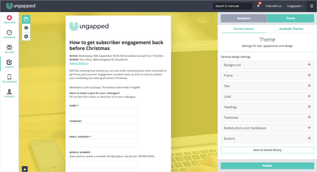
You can format and customize design as you please in Ungapped. Image source: Ungapped
3. Accessibility for visually impaired
How often have you considered how your survey (or all your digital marketing for that matter) looks in the eyes of someone with a color-vision deficiency? Probably never. But you should. With around 4% or 250 million people worldwide suffering from some kind of color-vision deficiency, chances are someone you are trying to reach with surveys and signup forms won’t see the same thing as you.
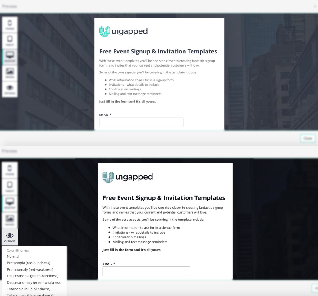
A survey viewed from normal vision (top) and the perspective of someone suffering from a color-vision deficiency (bottom). Image source: Ungapped
To save yourself the pain of having to jump between site simulators or filters, your survey platform should have a preview mode with the option to view your content from the perspective of those with color-vision deficiencies. This way you’ll be able to forecast any UX issues and edit your design accordingly. It’s a small feature to have but I can assure you those that do see your content differently will be more than thankful for your consideration.
4. Variety of question types
Depending on the platform or provider, you might not have access to all question types and that’s probably because of your payment or subscription level. Which is a bit of a shame. You shouldn’t be limited in the scope of questions you use just because you haven’t paid the same amount as a 500-personnel corporation.
When you’re researching survey marketing tools, take a look at whether all question types are included no matter your price tier. As well, check how well responses are measured and collated in the surveys’ statistics. It’s always ideal to use a tool that can aggregate ratings and scores rather than just spitting out a whole bunch of separated data that you need to aggregate yourself.
5. Theme library
One of the most convenient features you should look for in a survey marketing tool or provider is the ability to save themes and templates you’ve created to your own library. There’s nothing more frustrating than spending hours on amazing design and content that will rock people’s socks off only to realize you can’t duplicate or use the same template again.
Having the ability to save themes or templates you use regularly will save you time (and probably some sanity).
6. Responsive design (with responsive preview)
If you’re just getting started with survey marketing then it’s likely that the platforms you’re researching already provide responsive mailings. Since responsiveness has become accepted as a basic essential, most survey and email marketing platforms offer responsive design from day one. If they don’t have responsive designs, do not start using them. It’s as simple as that.
Sign up for an account with us. It’s free and responsive (of course)
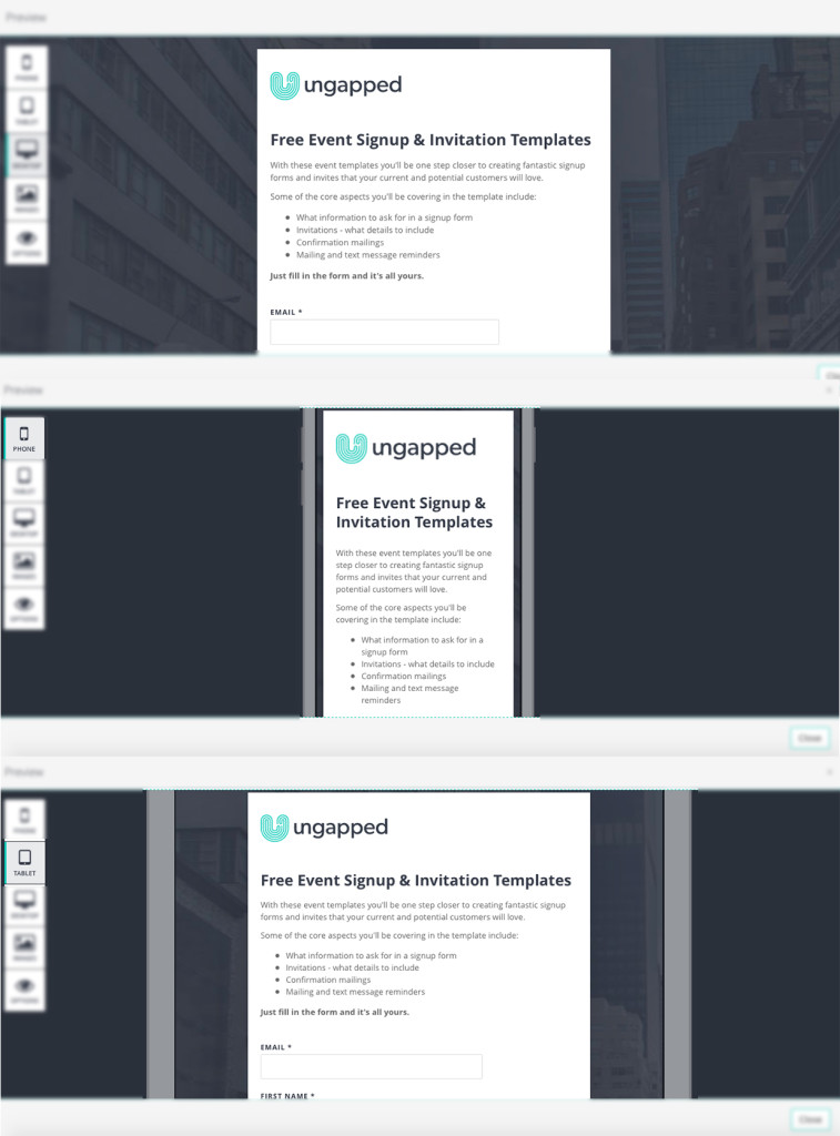
Responsive previews from the Ungapped platform. From top: desktop preview, smartphone preview and tablet preview. Image source: Ungapped
In addition to providing responsive surveys and signup forms, you should also check that the platform offers a preview-mode for different devices i.e. a preview mode for desktop, smartphone and tablet. Previewing what your survey and forms will look like across devices allows you to make sure your customer experience will be flawless no matter what device they are reading from.
Related: Here’s 5 reasons to convince your boss to switch platforms.
7. Rich statistics and insights (free from restrictions)
It is so important to use a platform with rich statistics and insights. If we can’t easily measure and report the efforts of our survey marketing we have no real way of knowing the impact our activities have on larger business goals.
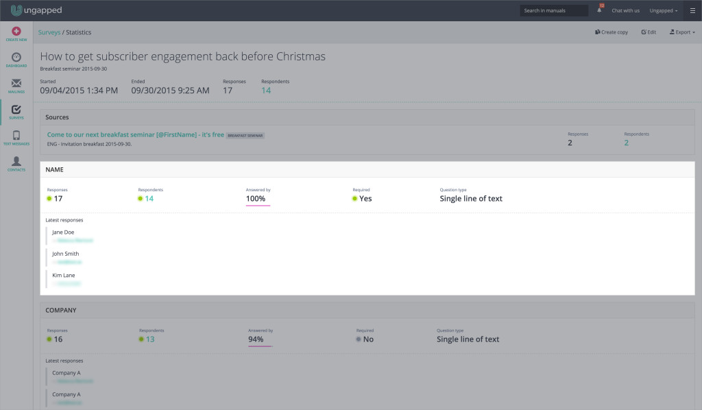
Image source: Ungapped
8. Exportable results
Once you’ve got survey or form responses, you’ll likely want to present them to colleagues or use them for another business purpose. The easiest way to do this is to export the results and upload them where you need them, in a CRM system for example. If you are unable to do this it’s going to be very hard to continue any further action on your survey or signup form results. Something as simple as printing your guest-list or planning future sales campaigns will be very difficult to do.
9. Ability to retarget those not yet responded
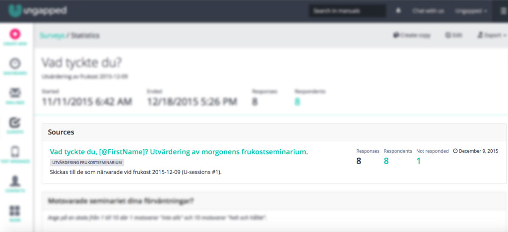
Not everybody has time to complete your survey or signup form when you want them to. Nor may be interested in doing so. But knowing who has and who has not completed your survey is a great feature that you can use to either retarget with follow-up communication or redesign the survey for better completion rates in the future.
10. Individual engagement for better CRM
What separates good survey marketing platforms from great survey marketing platforms is the ability to better manage the entire customer experience from the one platform. Being able to view individual contact behavior allows you to better see the overall experience subscribers are having with your surveys and consequently, your business.
Here is a screenshot of our CEO’s contact card from Ungapped that I took whilst within the statistics and insights of a completed survey.
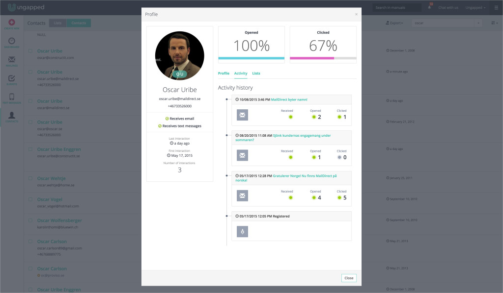
Image source: Ungapped
I’m able to see basic contact information by navigating to the profile tab, recent activity under the activity tab, and overall statistics mailing engagement. If we can imagine that this was a customer, we can see how this holistic overview would allow me to better plan not only future surveys but also mailing and text message campaigns.
If you aren’t able to do any kind of individual customer management with your current provider, it might be time to start thinking about swapping to a new platform.
Think you need to try something new?
Create an Ungapped account for free and play around not only with surveys but also mailing and text message tools.