
Design Tips for Email Newsletters – Part Two
By Sophia Skinbjerg | sophia.skinbjerg@ungapped.com
This post is a sequel to an earlier post. Haven’t read that one yet?
Read Design Tips for Email Newsletters – Part One here.
6. Use a background image with care
Using a background image in a mailing can be really visually appealing and a powerful way to connect with your reader. However, you still need to be wary of how the background image will transfer across devices and if it will distort/affect the message in your mailing.
Though most email readers (ie Gmail, Outlook, Apple Mail etc) can show the background of an email, this really is dependent on the device you’re using. On mobile for example, you will only see a small outline of the background image so if the background image is central to the story or content you’re sharing, it might be a good idea to keep images, patterns and GIFs within the body of the mailing rather than in the background. If you still want to include the background image, make sure you preview the mailing without images to ensure that your subscribers can enjoy the content without the background image.
If you know your subscribers are accessing your mailing from a desktop then you still need to be aware of how to optimize for different screen sizes. In order to use a background image, the file needs to be quite large since images don’t stretch over the entire background. This is fine if your subscribers are viewing the mailing from a screen the same size as you but if they are viewing from a larger screen, your background image might be repeated horizontally or vertically in order to fill the background. You can understand how this might confuse and distract your subscriber and might lead to them jumping straight out of the mailing, never having read what you had to say.
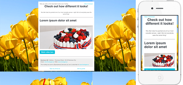
You can see here that even though the background image was the right size when editing, once I checked in preview it repeated to fit my screen and omitted most of the image on mobile. Source: Ungapped
As well, since the background image needs to be quite large the weight of the email becomes larger. This could effect the time it takes to download from a subscriber’s provider or it may not reach them at all since some servers have a restriction on the side of incoming emails. If in doubt, consider if the background image is vital to the mailing and consider putting in the email body rather than the background.
Take a look out our inspiration gallery for great examples of how to use imagery.
7. Let logo dictate color
If you find that you have all the content for your mailing ready to go but you just can’t decide on an appropriate color scheme, turn to what you have already and let your logo play heavy influence to the colors used.
Staying aligned with the current identity of the brand will also keep communication consistent allowing subscribers to easily identify who you are in their inbox.
If like many brands, you have just one or two primary logo colors, you can extend the palette by using a variety of shades from the main colors. This will prevent the appearance from becoming too ‘busy’ with to many or conflicting colors. Again, if you have access to a designer then this would be another opportune moment to ask for their help. Otherwise, beautiful social networks like colrd.com can help you select a color scheme based on one image, like your logo.
8. Be mindful of readers with color deficiencies
How well acquainted are you with the readings needs of your subscribers? Do you have any subscribers that are color-blind? If you know there are subscribers with these needs, you must create mailings that they too can access and read (easily).
There are some great tools like Check My Colours that help determine whether the color contrast is high enough for readers with color deficits. In our own platform, users are able to preview their mailing through the eyes of readers with different color deficiencies.
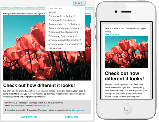
Ungapped users can preview their mailings using color-deficit filters.
If you don’t know whether any of your subscribers have any visual impairments or reading difficulties, send out a short survey and simply ask them. Those with difficulties are likely to be thankful for your consideration and you’ll have improved the relationship for both the reader and your business or brand.
9. Personalize with custom fields
Although custom fields aren’t a priority in other design tips for newsletters they are still important because personalizing a mailing is something that enhances the reader’s experience. It’s also super simple to implement. Most (if not all) email service providers and platforms will have a feature that allows you to easily insert a custom field such as first name, last name, email, and company anywhere in your mailing.
Personalized fields can be used in the very beginning of your mailing, at the end of your mailing or it can be used to directly address your reader within a body of text. The important thing to remember when using personalized fields is that you must think about the purpose of your mailing. This is because not all placements are as effective as one another.
For example, using a personalized field in an introduction line might not be the most effective way to convert your reader since it’s very common and the reader might just glance over it anyway. Compare this to using a personalized field within a text body to upsell a product or service. If a reader spots their name within a larger text body, there are more likely to read the whole text in order to understand why their name is there in the first place.
10. Responsiveness
Arguably the most important of our design tips for email newsletters is responsiveness of the mailing.
Since your subscribers can be reading your mailing from a variety of devices, it is of absolute importance that your mailing takes this into account and is designed in a way that will be easy to view, read and click-through from smaller mobile and tablet devices.
If you’re not a design-pro, don’t freak out. Making mailings responsive is easier than you think provided you are armed with the right tools. If you’re using an email service provider or platform, your mailing should be made responsive automatically and you should be able to preview somewhere within the mailing editor. If your email service provider or platform does not automatically create responsive mailings, it should be your priority to seek a platform that does.
Can readers read your mailing across all devices?
11. Make it easy to unsubscribe
A simple design mistake often made is the placement of the unsubscribe link or button.
Most mailings will include the unsubscribe button either at the bottom of the mailing or within the footer. This makes sure that the unsubscribe option isn’t the first thing people see (pulling their attention away from the content) but also keeps it in an easy-to-find place that is consistent across all mailing templates.
Since the bottom of the mailing or footer is quite commonplace, it could be useful for you to follow the same practice as most of your readers will navigate towards the bottom of the mailing should they want to unsubscribe.
Because it is mandatory to include an unsubscribe button or link in all mailings, and omitting it entirely could lead to harsh penalties from industry regulators and legal authorities, there is no excuse if you do not include it in your mailing.
Ready to start using these design tips for newsletters?
If you already have an account with us, log in here and start using these design tips on your next mailing.
Don’t have a Ungapped account? Sign up for an account – it’s free!