5 easy survey mistakes that are probably hurting your response rate
By Sophia Skinbjerg | sophia.skinbjerg@ungapped.com
Creating a survey is an excellent way for you to collect data about your customers. However, you might be making some easy survey mistakes that can hurt your overall response rate. The great news is that they are all easily avoided. Let’s cover five of them right now.
Speeding past the customer journey
Too easily can marketers get caught up in the rush of everything – which is understandable. We have a lot to do. But we still need to take the time to consider the customer journey in everything that we do. And one of the biggest survey mistakes (and incidentally, one of the first survey mistakes) is that marketers forget to consider the customer journey when creating a survey. Remember that for every survey you create you must be able to answer;
- why is this survey important to us?
- what happens if we don’t run this survey?
- why would a customer or other key audience member fill out the survey?
- when is the best possible time to reach people?
- what is the best possible way to reach people?
- how will we use the data from the survey to change our current business efforts?
Related: Get a complete view of your customer journey in 5 easy steps
Ignoring mobile
Working with this on a daily basis means that I have very little tolerance for surveys and forms that aren’t responsive across devices. If I jump into a survey on my phone and see it’s not optimized for the smaller screen I just jump back out and simply never fill it out. Your survey audience might be a little more forgiving but I can assure you that their attention will quickly wane if you ignore designing for mobile first.
Ungapped users, take a deep breath. Your surveys are always responsive.
I won’t go into proving why mobile design is so important or how much mobile use plays a part in our daily lives because there’s an abundance of that research out there already. What I will say is that mobile is core to your survey engagement. If you want people to answer your survey then it needs to work on mobile, it needs to work on tablets and it needs to work on laptops.
Need a responsive survey tool? Get started for free here.
Making a survey that’s too loooooooooooooooooooong
A couple of months ago we had a guest speaker at our breakfast seminar from the European Institute of Behavioral Analysis. Over the course of an hour, Mårten Westberg gave some efficient advice to Ungapped users. One of those pieces of advice was to quit making such long surveys.
If a survey is long it means you’re trying to seek out too much information in one survey. If this is the case, break it down into multiple surveys and administer them at different intervals (i.e. not all at once).
Related: Help! how can I boost survey completion rates?
Forgetting to consider vision impairments
How many of your survey participants have reading impairments like color blindness or dyslexia? I’d be impressed if you can give me a specific stat. I’m empathetic if you can’t – for many marketers it’s not something that’s often top of mind. But it should be. If people can’t read your survey easily, why would they want to fill it out in the first place?
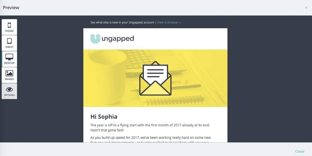
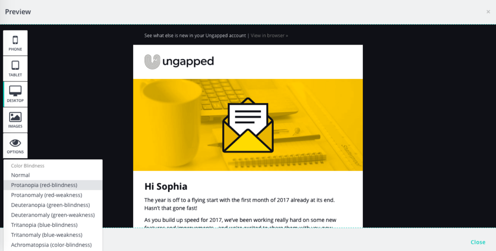
Ideally, you should be using a survey platform that takes things into consideration to make it easier for a) you as the designer and b) the end reader. Ungapped users, we’ve got you covered here. If you choose to share your survey via email, you can easily view your surveys through impairment filters.

Previewing a draft in the mailing editor

Viewing a draft through one of the color blindness filters.
All the people reading your email also have the chance to adjust a mailing that best fits their visual needs.
Forgetting the best way to distribute your survey
Marketers are drilled with the concept that you have to know your audience. You have to know who they are, what they value from a brand, and which channels they prefer to be on. Yet sometimes, when we have this mantra etched into our minds, we still forget it when sharing or distributing the survey amongst customers.
It’s an easy survey mistake. It’s easy to assume that sharing a survey link via one communication channel will guarantee you a lot of responses. That’s not really the case. If the only contact details you have of a key person is an email or phone number, sharing the survey on Facebook isn’t really the best way to reach them.
Likewise, if you have a number of followers on Facebook that you know you don’t have their email or phone numbers, designing a mailing for them is also irrelevant.
The point here is that you’re going to have a combination of both. You probably have emails or phone numbers of customers (or those you want to survey) but they aren’t social media followers. You probably also have social media followers that have not yet shared their email or phone number with you. The solution? Share the survey across all channels where your relevant audience members are.
Start using a better survey platform
If you’ve read through this post and realized that your current platform doesn’t have features related to these survey mistakes then it’s about time you swapped to one that does. You can get started with Ungapped for free right over here.
Updated June 2022. The article was written in 2017.