
How to create call-to-actions that are irresistible
By Niraj Ranjan | niraj.ranjan@hiverhq.com
This week we have founder and CEO of Hiver, Niraj Ranjan as our guest blogger. Having worked exclusively with Gmail for over 5 years, Niraj shares with us his knowledge of what makes an irresistible call-to-action and how you can start creating them for your own mailing campaigns.
A powerful call-to-action can tempt even some of the most unlikely prospects to do business with you. But if not done well, the same CTAs can repel prospects away.
Let me share a personal example with you.
Long before we understood the importance of strategy in CTAs, we at Hiver, learnt some lessons of our own. Basically, we weren’t hitting the blog subscription rates that we were aiming for. Our static ‘Subscribe’ button on our then blog used to appear a little too late. Customers had to scroll down to the bottom of the article to before they saw it for the first time. We decided to try the slide-in style, where the CTA appears 1 min after you land on a page. This simple change led to a result where our subscribers-per-visit increased by 20%.
CTA is not a random game. From the typeface you choose to the length of the CTA, everything plays a very important role. Below is a great example of prominent, and aesthetically pleasing CTAs at just the right places.

Source: ungapped.com
How do you create call-to-actions that are irresistible to prospects then, you might ask? Well, it takes a combination of three elements; strategy, user behavior and aesthetics. I’ll go through each element below with tips on how you can get started right away – regardless of whether you’re a newbie or well-seasoned expert.
Element 1: Strategy
Creating a click-worthy CTA is not some random luck game. Just as you optimize your email subject lines to get more clicks, you should strategically plan your CTAs as well. Here are a few ways to do that;
Get the timing right
Scenario A:
A potential customer enters your website and not even a second later, boom! There goes your CTA forcing your lead to subscribe even before they got a chance to look around the website.
Scenario B:
Your potential customer has come to your website, perhaps from social channels and started checking out your blog. They jump between a few posts and spend a few minutes reading but never hitting the end of a post (where your CTA is). They leave your blog and head back to what they were looking at before. They never even saw your CTA and you’ve missed out on a lead.
My point is – determining when your CTA should appear is very important and I suggest that you do a little bit of experimenting with different variations to determine your sweet spot.
Aim to match your users’ needs
The whole point of the CTA is to encourage your lead to take action, but what if your prompt is too generic or irrelevant even to that person? Well, they will not care enough to take action. Get an idea of what exactly is your customer looking for using analytics and observing past behaviour and then improve the design of your CTA to improve the likelihood of getting yourself a new customer.
Make your CTA time-bound to create a sense of urgency
The best way to push a prospect into action is by creating a sense of urgency. So, when you make offers and discounts, make them time-bound and use your CTA to communicate that. For example, instead of saying ‘Click here to access your offer’ say ‘Hurry! Special offer for a limited time only’.
Related: Discounting in the digital age
Position a CTA strategically
Your CTA must be clearly visible to the visitor for as long as they are spending time on your website. This way you get more visibility and exposure. One way to do this is to integrate your CTA with your main menu bar so that it’s visible all the time. Another strategy is to place a CTA on all of your website pages individually. The choice is up to you but make sure that whatever you roll with is backed by data.
Generally speaking, the best position for a CTA is the top or the middle of the page. If it’s too much to the left or right, your customer may overlook it. Check out this example from treehouse. Their CTA is both at the top of their homepage as well as in the menu along the top of the page which is shown wherever you are on the website.
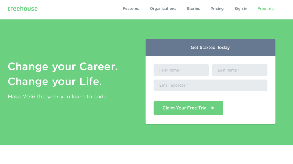
Source: teamtreehouse.com
Element 2: User behavior
It’s always important to consider the user perspective when designing your CTAs. Here are the top three things to keep in kind.
Don’t try click-baiting them
Never bait them! If you tell them that this link is going to take them to a certain page, make sure it does. Don’t try to trick them into landing on other pages you want them to check out. This especially applies to offers. If you say ‘Click here to get a discount’, then ensure that they do. Don’t add a catch after clicking on the page saying you will only get the discount if you fill out some lengthy survey.
Related: For more email conversions, build better landing pages
Always maintain clarity
Have you ever gotten one of those emails which have so many CTAs that you just don’t know where to click? Don’t bury your most important hyperlink under all the unnecessary ones; give your users a clarity on what to do next. If you leave them baffled, they won’t know what to choose and will probably bail on you.
So, judiciously pick what CTAs you need put on the page and make them count. Absolutely avoid random and irrelevant links.
Use the right words for the right audience
Let’s say you are sending an email to one of your longstanding luxury-end customers. If you send them an email with a CTA saying ‘FREE, FREE, FREE’ you probably won’t entice them because they are not exactly low budget buyers. Instead, if you say ‘Loyalty offers on your favorite brands’, now that will catch their interest.
Additionally, in your CTAs, make sure to tell them what its function is. For example ‘Click here to pay’ etc. Don’t use mysterious phrases for your CTAs because people will usually find this suspicious (and not click).
Element 3: Aesthetics
Look aesthetic, look classy. Your CTAs absolutely must look pleasing to the eye. Keep your CTAs aesthetically pleasing by;
Staying clear of banner ads
Your CTAs must grab your customer’s attention, but not repel them. Simplicity is the key and you should never make your CTAs an annoyance. Use the right colors – subtle and classy, and an easy-to-read font size. How you design your CTAs can make all the difference between your users clicking on them or cringing away from them. Check out this awesome example from Spotify:

Source: spotify.com
Not being loud
Have you ever landed on a website and seen a blingy and big CTA such as, ‘FREE’, ‘BUY NOW’ etc., flashing at you, with a loud ding? Very annoying, isn’t it?
It gives the impression of you trying to force your customers and leads, and end up completely overwhelming them. Keep it simple, neat and elegant.
Getting wildly creative
Since the point of a CTA is to grab your customers’ attention and nudge them to take an action, using your creativity in creating hooks is a great idea. You can use these hooks to incite curiosity and interest in the readers.
For example, ‘Who wants to stay healthy, say aye’ can be more attractive than saying ‘Click here for health tips’.
Final thoughts
Remember, there is obviously no one-size-fits-all CTA design plan. Every business must experiment and figure out what works best for their goals and purposes. Provided you use a combination of strategy, user behavior and aesthetics to create call-to-actions, you should be well on your way to enjoying higher conversions whatever the offer.